Perfect Properties Resposive Website
(UI Design)
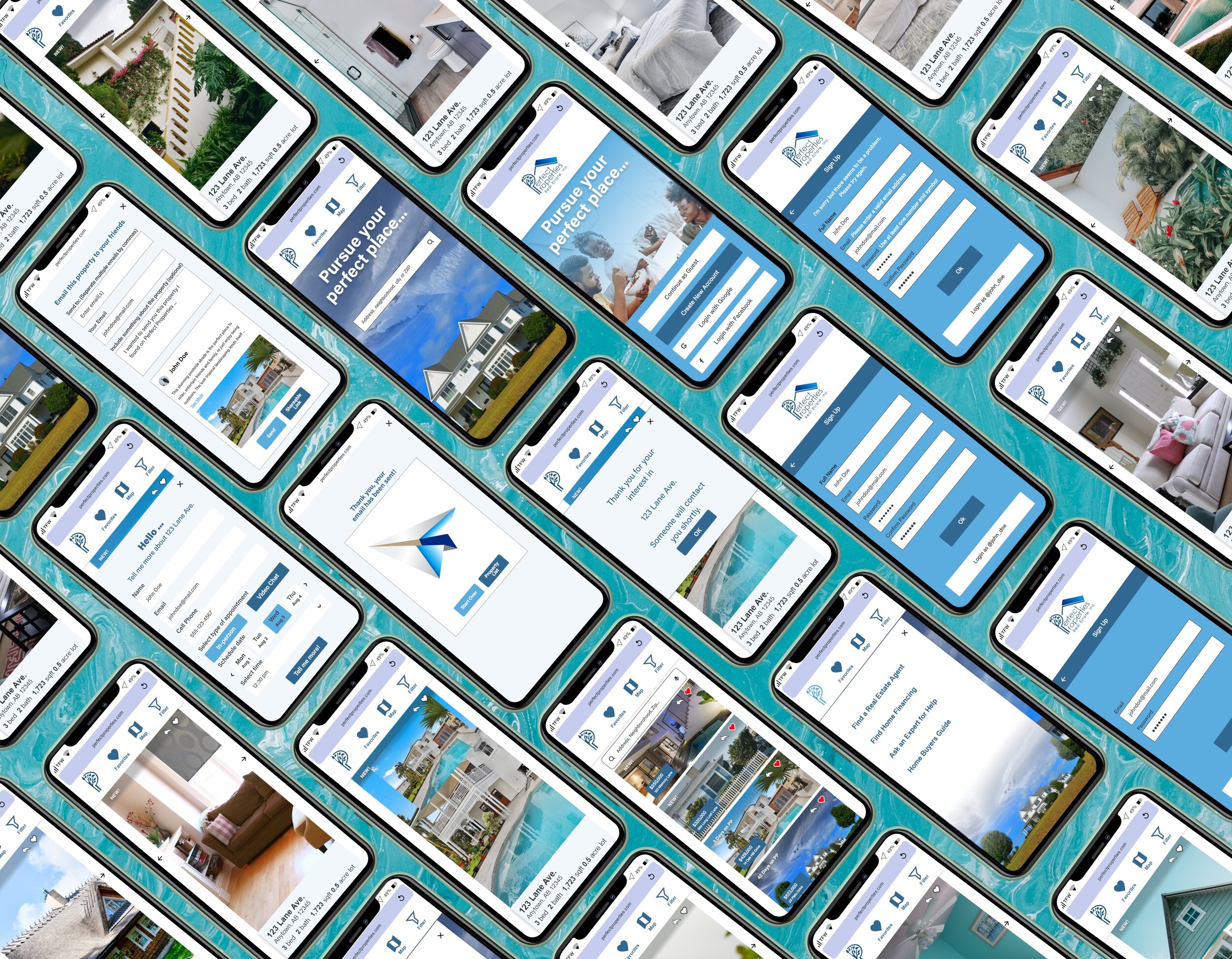
This is a real estate responsive web app that provides property buyers with information on properties of interest. The responsive website would help users who are relatively new to the home buying experience feel more empowered to make informed decisions about property investments.
The Challenge
Location, location, loocation …. its a very common cliche’ in the real estate business. Not knowing what a location entails can be a very concerning factor for a perspective home buyer. Looking to purchase a new property in an unfamiliar location can be a risky venture, not to mention a poor investment. Many perspective home buyers don’t want to waste precious time looking at properties that are above their price range or are a money pit. Home buyers need a way to find a good home in a dersirable locaiton at a fair price.
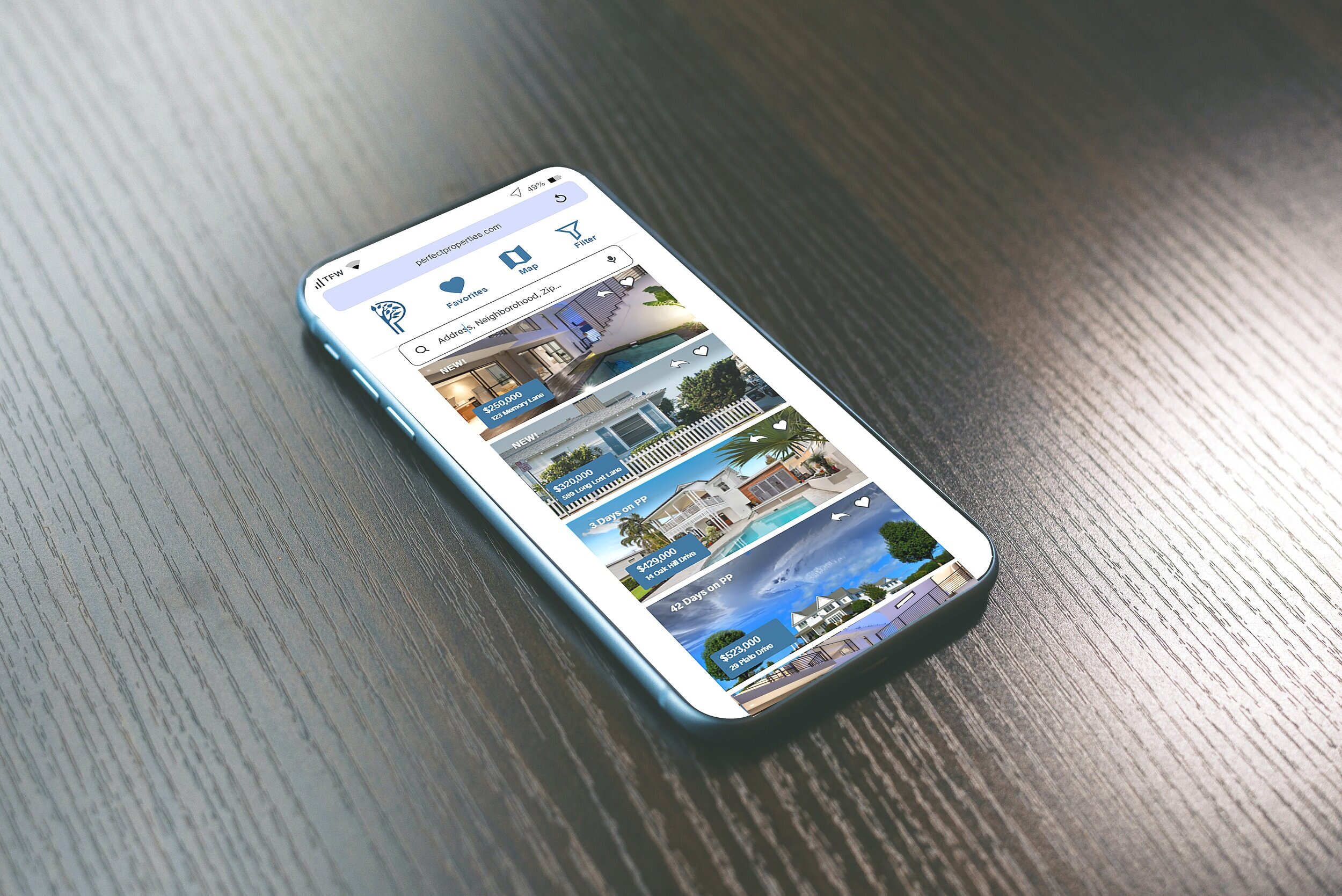
2. The Solution: Perfect Properties
Real Estate is one of the best financial investments that an investor can make today. More often than not, investors recieve a far better return on their purchases than on most money making endeavors today. That is why Perfect Properties has been developed to help home buyers to do just that.
3. Project Introduction
-

Context
Real estate investment is an increasingly popular way for individuals to achieve financial security. It is an exciting and emotional experience, but often complicated. While there are plenty of blogs and agencies providing information, often, buyers new to the market may struggle to get started without professional guidance and waste time viewing properties out of their range. This web app will provide them with the expertise needed to get started efficiently
Role: UI Designer
Tools: Adobe Illustrator, Adobe XD Adobe Photoshop, Balsamiq
-

Why Perfect Properties?
This web app is made primarily for new, small-scale property buyers who are looking to invest for additional income or financial security. This will be a user-friendly, responsive web app containing a database of available residential properties and land, and comprehensive information on each listing. Buyers will use this tool when conducting property searches, and making a decision about where to invest. Buyers will use this tool at home or on the go. Users can search for properties anywhere, as long as they’re logged in on a device. Unseasoned buyers need access to reliable, uncomplicated information about their potential property investments. Buyers get a feel for a place by viewing comprehensive information about the property and its neighborhood before spending time on-site.
4. My Design Process
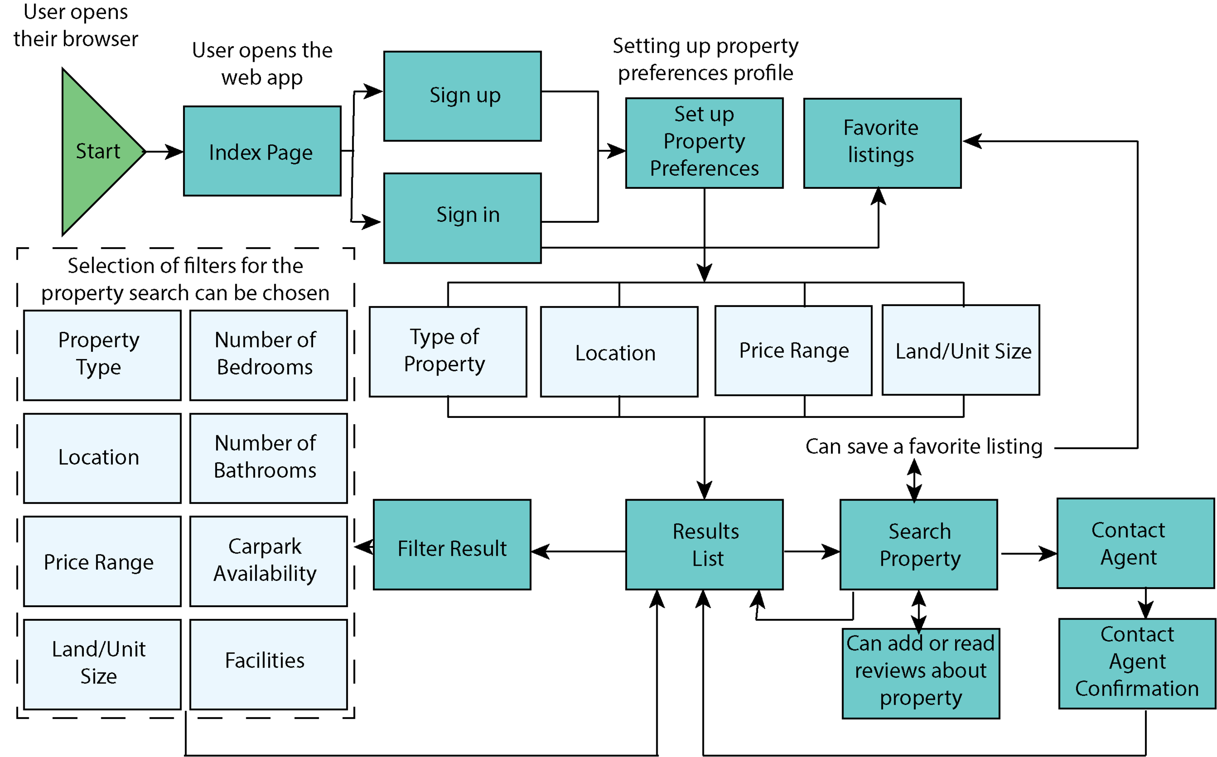
5. User Flow for Perfect Properties
Since this was a User Interface focused project, user flow and most of the research were already provided. I did enhance it to reflect a more definitive user flow. I also did real estate research to get some inspiration.
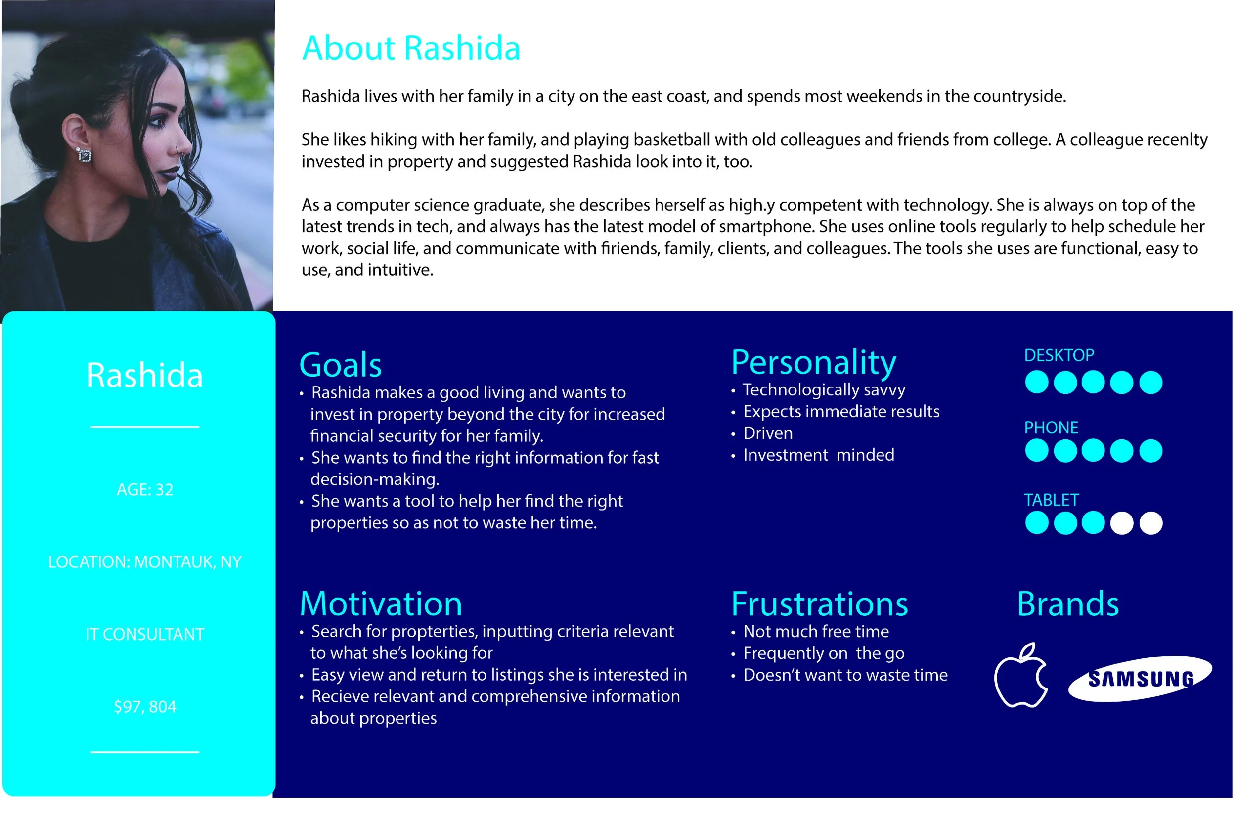
“I want to provide my family with financial security. I’ve been considering buying property for a while, and am looking for a tool that can help me find what I’m looking for, quickly!”
Who?
This web app is made primarily for new, small-scale property buyers who are looking to invest for additional income or financial security.
What?
This will be a user-friendly, responsive web app containing a database of available residential properties and land, and comprehensive information on each listing.
When?
Buyers will use this tool when conducting property searches, and making a decision about where to invest.
Where?
Buyers will use this tool at home or on the go. Users can search for properties anywhere, as long as they’re logged in on a device.
Why?
Unseasoned buyers need access to reliable, uncomplicated information about their potential property investments. Buyers get a feel for a place by viewing comprehensive information about the property and its neighborhood before spending time on-site.
User Persona for Perfect Properties
6. Prototypes
-

Low-Fidelity
These low-fidelity prototypes were hand-drawn on a white board and then I used “POP” for user testing.
-

Mid-Fidelity
I created the mid-fidelity design in Balsamiq and conducted user testing for this iteration.
-
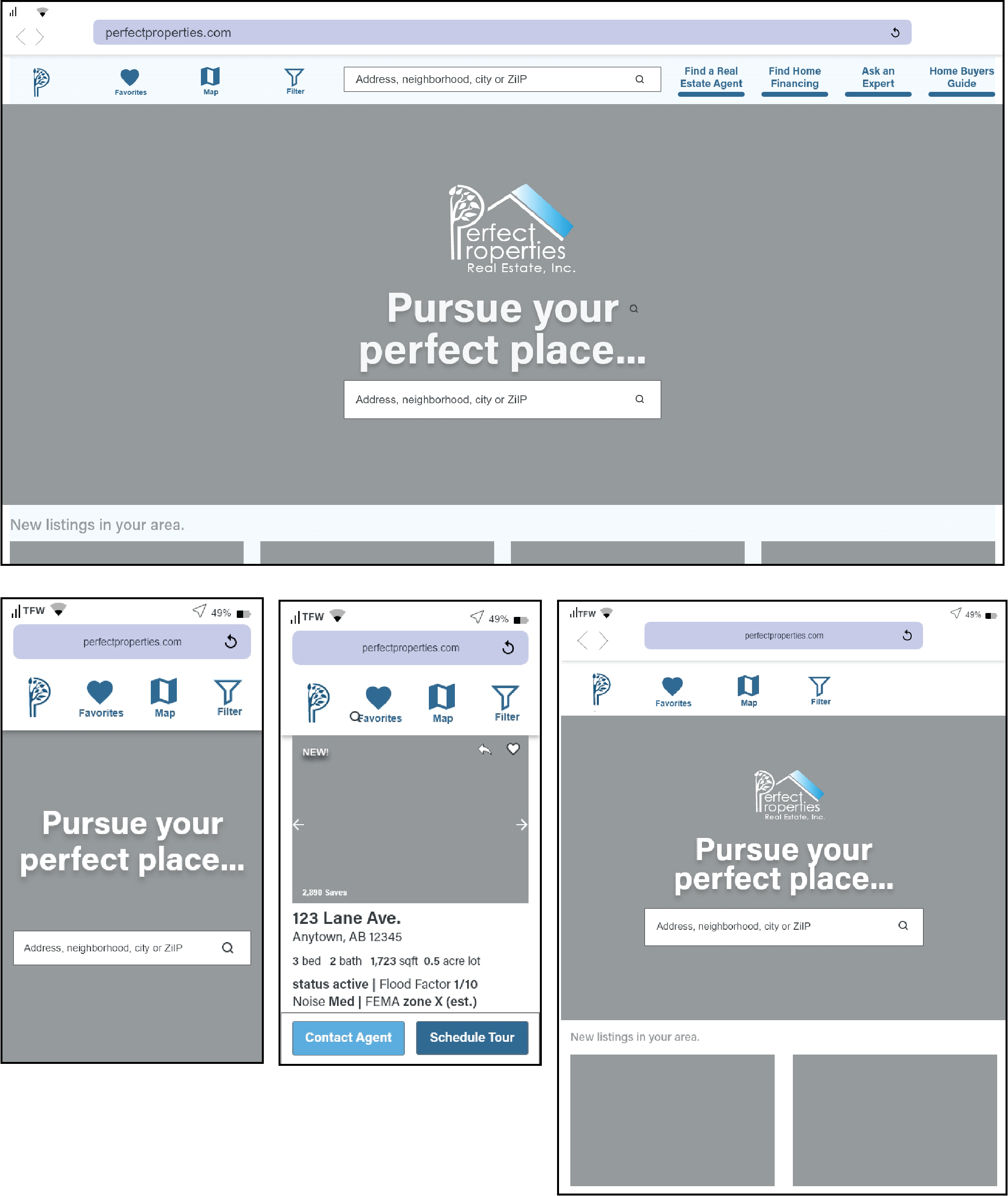
High-Fidelity
I then created a refined design version with an underlying responsive grid system that was like a skeleton for the layout of the content.
7. Mood Boards
-
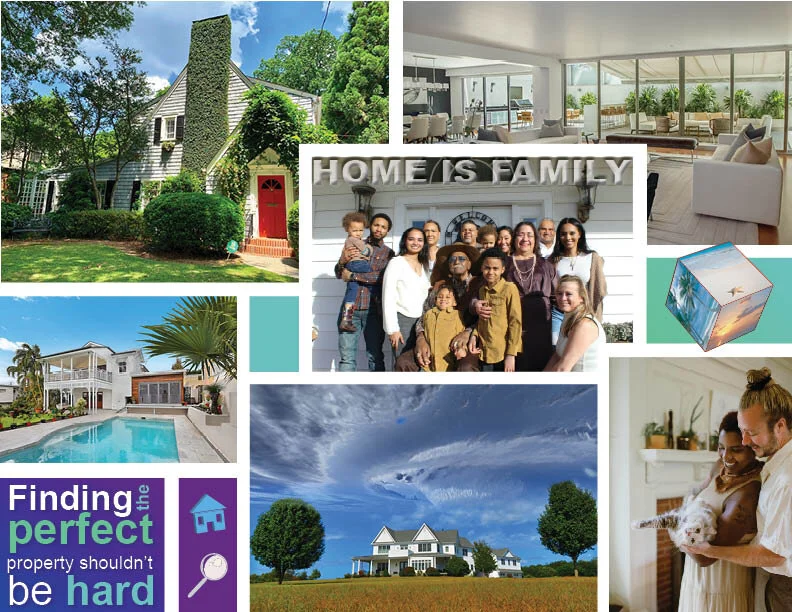
Mood Board #1
The client wanted a color scheme that consisted of blues, purples, and greens. I used different elements that seemed to reflect those requirements.
-

Mood Board #2
Much like the first mood board, I used similar colors. I also added some fun elements that I thought would furher enhance the user experience. After trying the shocking bright green button in the actual design, I found that it didn’t work very well. But the color scheme is the one that I went with in the end.
Grid Breakpoints
I used a responsive fluid grid to algin all the elements on each screen for each breakpoint.
8. Style Guide
The style guide gives all the necessary information for the development team before hand off.

Takeaways
Ideally…
as time goes on, the responsive website would be improved upon through debugging any potential errors, expanding sevices through the website, and updating future versions. In response to customer input, the website could be further developed to meet even more customer requests and suggestions.
If I had more time, I would have …
Expanded upon static pages
Conducted further user testing
Accessibilty considerations


